
Your CV needs to make a big impression on employers if you want to receive an invitation to interview. One of the key design areas that you need to get right is your font. But, what is the best font for your CV?
Font is more important than you may think as it can suggest a lot about you. The font you choose could suggest certain things about your personality and professionalism. These are certainly factors that will affect the employer’s decision of whether to take your application further.
Hiring Manager’s have a lot of CVs to look through. This means that they may only spend seconds speed-reading your CV. If your CV is not aesthetically pleasing and easy to read, it will not hold their attention for long.
This is why it’s a good idea to consider your CV font carefully. But, with so many fonts to choose from, where should you begin when formatting your CV? Well, there are a few key factors that you should bear in mind when making your font choice:
If you can tick these boxes, you’re already on the right track. Now, let’s take a look at the top five CV fonts that we recommend.
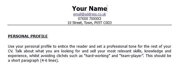
Tahoma is one of our favourite fonts. It looks professional and is very easy to read. It’s also part of the sans serif typeface family that is available on every computer operating system. It’s a great font that sends the right message for the vast majority of roles you can apply for.
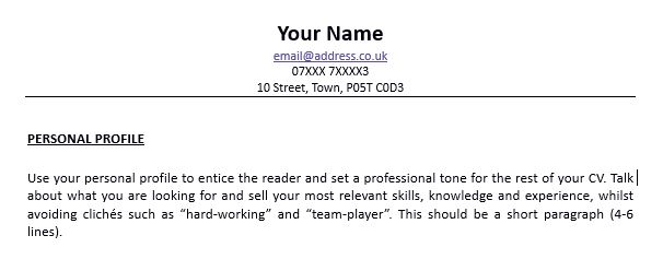
Calibri is more modern looking and has been Microsoft Word’s default font since 2007. It’s quite soft in appearance, so if you’re applying for more hard-hitting, competitive roles, there may be a better option out there for you. However, it’s perfect for more creative and digital roles.
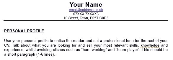
This is a font favourite for many typographers and designers. You may recognise Helvetica from logos such as BMW and Microsoft. It is modern looking and has very clear lines which give your CV a contemporary but professional vibe.
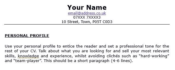
Verdana is another one of the sans serif fonts. It has wider letters than the other fonts in this list and therefore you can get away with smaller sizes. It has a clean and modern look which makes it easy to read and ideal to use for your CV.
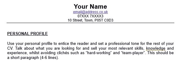
Arial is a classic font and a safe bet for your CV. However, the only danger is that Arial is one of the most common, and some might say overused, resume fonts. On the one hand, it does look professional and is easy to read, but on the other it may be considered a little boring.
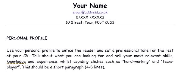
Hopefully you’ll be aware by now that Comic Sans is considered one of the worst font choices ever! It was created to look like comic book speech bubbles which certainly isn’t a good look for your CV. It’s a font that looks quite childish and very unprofessional so steer clear!
Ultimately, it’s down to you to choose a font that you think best reflects your personality and professionalism. Avoid those that are hard to read and select a font size between 10-12pt. Other popular font options include Century Gothic, Lucinda Sans, Times New Roman and Gill Sans – although these aren’t our favourites.
If you’re struggling to get started with your CV, download our CV template as a starting point.
Follow us on Twitter, LinkedIn and Facebook for business insights, interview tips, advice and career opportunities.
Notifications